Among the unicycle commuters and standing-in-queue-enthusiasts of Portland, Oregon, there’s a handful of people who make real, physical products. The folks I know personally tend to skew hipster housewares: My friend Rob produced a few thousand metal/wool/bamboo + mason jar French presses; Ken’s company is founded on hardwood iPhone cases; and Alyssa manages a company that sells fancy-pants sliding door hardware (actual door not included).
Two weeks ago, a friend asked me over some beers to help analyze sales data for one of their product lines. My friend’s line consists of about a dozen items, each item available in two colors.
Customers could buy any combination of items, and my friend wanted to know both which items and which combinations were the most popular. Technically, this is known as “affinity” or market basket analysis. There are plenty of fancy algorithms for this problem (think Amazon’s “customers who purchased this item also bought…”), but since my friend only has a dozen items I thought the easiest thing to do would be to just directly visualize his sales data.
Bar charts
Now, if customers could only buy a single item at a time, then visualizing the sales would be easy: We could use a simple bar chart (where A, B, and C are fine hipster products):
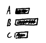
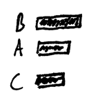
Here we’ve sorted by item name: A, B, and C. A common way to improve bar charts is to sort by magnitude so that the bar labels also act as a rank-ordered list:
A matrix
Stepping it up a dimension: If customers bought only two items at a time, we could visualize the item-pairs in a grid:
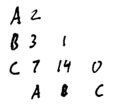
Here we see that three people bought items A & B; 14 people bought B & C, one person bought two copies of item B, and so forth. We can trade the ability to exactly read off each value for a better overview of the whole dataset by replacing the numbers with shaded squares:
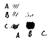
Darker colored squares means more sales (pretend I can cross-hatch with a pen, aight?).
Of course, the whole problem is that the orders don’t neatly contain just one or two items. Some orders are for one item and others are for five. What we need is a visualization that allows us to compare all orders and to see which combinations of items customers are buying.
If you want to play along at home, grab a pen and sketch out your own ideas. The rest of you, scroll on down.
…
Are you sure you can’t think of any other visualizations? Come ‘on, give it a shot…
…
A table
Okay, this is what I came up with:
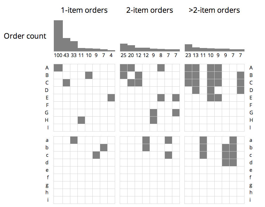
My friend’s products are listed along the sides, grouped by color (items A–I are one color; items a–i are another color). The number of orders for each combination is shown as a bar at the top of the column. All of the counts are distinct. For example, there were 100 orders for A alone and an additional 25 distinct orders for A and B together.
The columns themselves are grouped by the number of items in the order: The first column group are the top 7 single-item orders; the second group are the top 7 two-item orders, and the third group are the top 7 orders containing more than two items.
Once the sales are visualized like this, some observations jump right out:
- the first color (items A–I) is far more popular than the second color (items a–i)
- of the 14 multiple-item combinations displayed, none of them include items from both colors (AKA, customers prefer matching color schemes)
- items A, B, and C are very frequently purchased together in both colors
- very few people (if any) are buying products F or I in either color
This was a quick and dirty visualization for a friend, but if I were to extend it this is what I’d add:
- a bar depicting the margin (profit) for each item combination
- rank combinations by margin or profit rather than by total number of orders
What do you think? Did you think of a clearer way to visualize the co-occurrence data?
A homework assignment
For the technically-curious: I rendered this graphic as an HTML <table>.
This was awkward for a few reasons, though:
- the tree structure of HTML forces a symmetry break between columns and rows: HTML forces row-major ordering, which makes it difficult to write separate functions for the bar charts, labels, and item-grid.
- spacing between rows and columns cannot be done with CSS, I had to use empty
<tr>and<td>elements to separate the bar charts, product row groups, and order-cardinality column groups (gross!)
A homework assignment for the foolish / brave is to investigate a cleaner ways of drawing this picture. Personally, I’d look at using a system of constraints: Either the browser’s built in flexbox or a JavaScript constraint-solver like Cassowary (which powers GSS).